Designing a family safety app that doesn't feel like surveillance
By Uday Kiran Reddy, product designer in Hyderabad, India
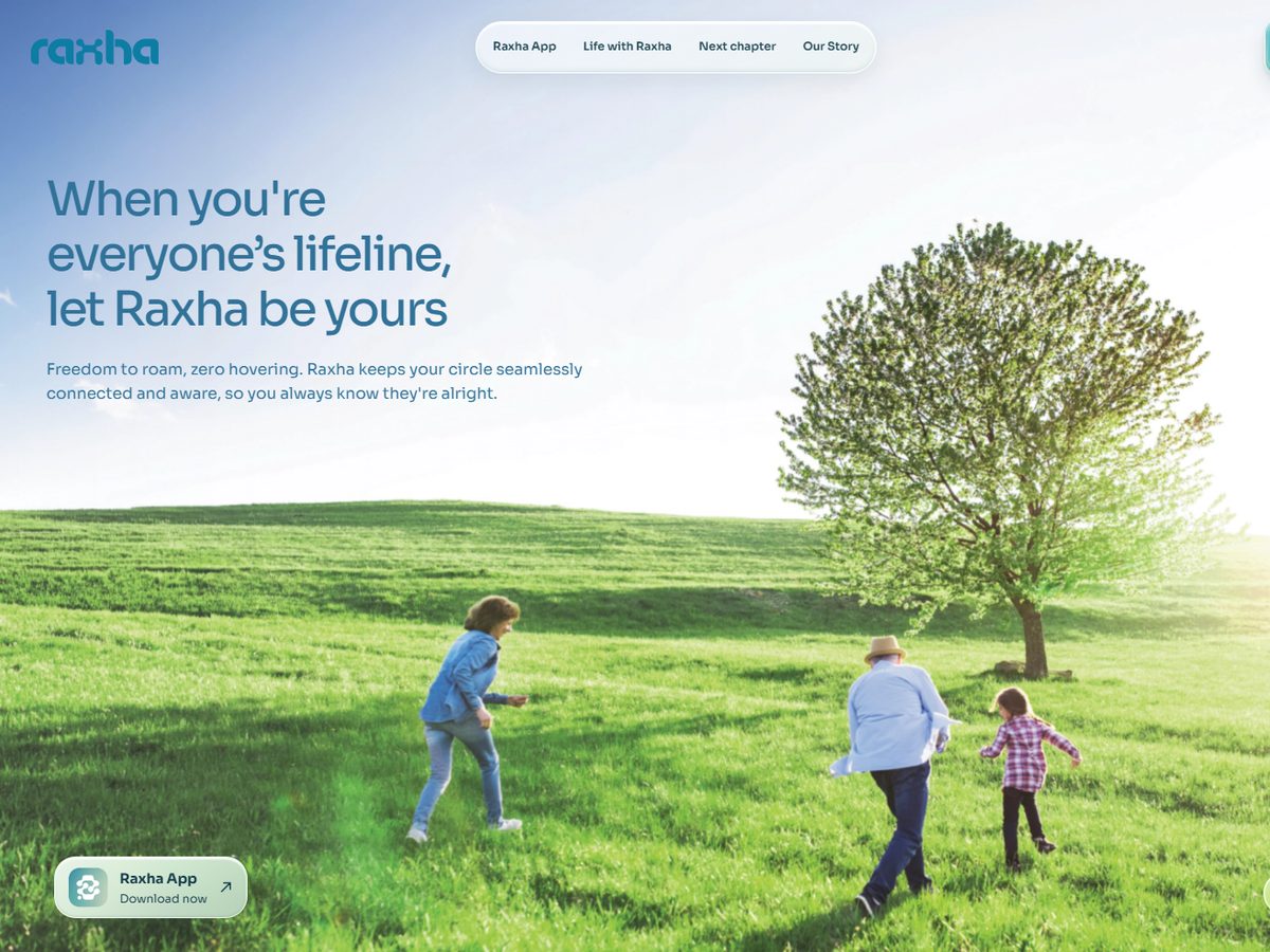
A family safety app earns trust by doing less on screen and more in the background. In Raxha, a family safety app for iPhone and Apple Watch, that meant a few firm rules: the interface only claims what live data proves, coral appears only in real emergencies, invites come from a person rather than the brand, and success means people open the app less.
Why do most safety apps feel like surveillance?
Because they answer worry with more data on screen: maps, pings and dashboards. The guardian ends up supervising, and the person being protected feels watched. Raxha starts from a different promise: if nothing is wrong, nobody has to ask.
What does "render-true" mean?
The interface may only show what live data proves. No simulated heart rate, no greyed-out placeholder rings, and never the word "safe" based on location alone. When the app knows less, it says less, and it says why.
How should colour work in a safety app?
Colour is a promise. Raxha uses one coral, and only in the emergency chain. Amber is the single attention colour. Green appears only when something is verified. No status relies on colour alone: each one also has a shape, a pattern or a label.
How do you invite family without dark patterns?
The invite comes from the person, not the brand: a WhatsApp or SMS message with a 6-digit code that lasts 48 hours. The guardian accepts on the web without installing anything and sees exactly what they will and won't see. Saying no is a proper option, the code goes back unused, and nothing is resent automatically.
How do you handle false alarms?
An SOS or a detected crash first runs a local check on the wearer, with a large "I'm OK" button. Guardians see a calm "checking" state, and the full alert comes only if there is no response. When an alert turns out to be false, the app says so plainly, takes the blame, names the cause and says what it changed.
What does success look like?
- Fewer app opens while protection stays on.
- The daily view answers "is everyone okay?" in under five seconds.
- At most two gentle prompts per topic, and skipped steps stay skipped.
- Every capability gap is stated the moment it appears, for example "Vitals need a watch, everything else is on".
Questions
How do you design a safety app that respects privacy?
Show only what data proves, keep live location trails to active sessions or incidents and delete them afterwards, let anyone leave a circle with immediate effect, and say plainly when something isn't working.
What is Raxha?
Raxha is a family safety app for iPhone and Apple Watch. Its website is raxha.app.