Colour as a promise: giving every colour one job in product UI
By Uday Kiran Reddy, product designer in Hyderabad, India
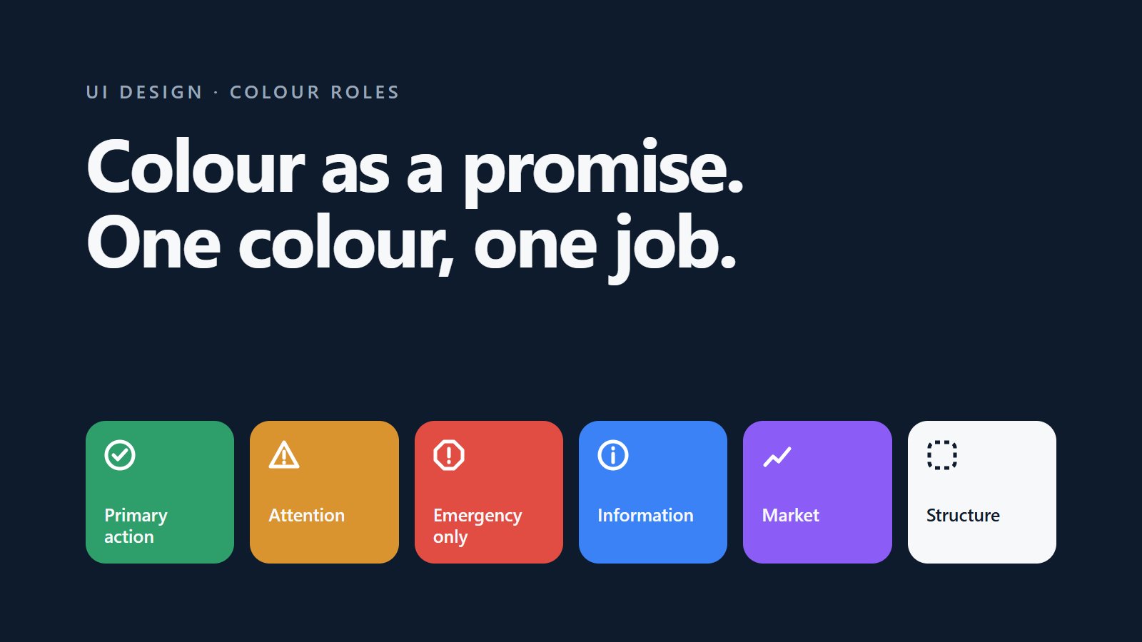
Give every colour in an interface one job and never let it do another. When green always means the primary action, or coral always means a real emergency, people learn the meaning once and trust it everywhere. Two very different products I worked on, Raxha and Labrix, both run on colour roles like this.
What is a colour role?
A rule that ties a colour to a meaning, not to a component. "Buttons are green" is styling. "Green is the primary action, and nothing else is green" is a role. The second one tells every designer and developer what to do on a screen nobody has designed yet.
What do colour roles look like in a real product?
In Labrix, an AI workspace for food scientists:
- Green: the primary action only
- Amber: workflow hints
- Blue: information
- Purple: market content
- Red: destructive actions
- Neutral: active tabs
In Raxha, a family safety app:
- Coral: emergencies only
- Amber: the one attention colour
- Green: only when something is verified
- Navy and greys: structure, and states that are fine but not verified
Why does it matter more in some products?
In a safety app, a colour that shows up too often stops meaning anything. If coral appears on a promotion, it will be ignored on the day it matters. In an AI product that keeps adding features, roles stop every new button from competing for attention.
Isn't relying on colour bad for accessibility?
Yes, so a role is never the only signal. Raxha's rule is "never colour alone": every status also has a shape, a pattern or a text label. The colour makes the meaning faster to read for most people; the label makes it readable for everyone.
How do you get a team to follow colour roles?
- Write the roles as a short list in the design file and next to the colour tokens in code.
- Name tokens by role, such as action, attention and danger, not by hue.
- Review new screens against the list: every coloured element should have a role.
- Keep the list short. Five or six roles cover most products.
Questions
What are colour roles in UI design?
Colour roles are rules that give each colour one fixed meaning, for example green for the primary action only and red for destructive actions only, so users can trust what a colour means on every screen.
How many accent colours should a product use?
As few as the meanings it needs. Five or six roles cover most products, and each extra colour is one more meaning people have to learn.